Dean Waugh on The Right Optics Podcast by SILMO
The Right Optics podcast is brought to you by SILMO, the leading eyewear and optics trade show. Hosted by Nick Coffer, the podcast brings you in-depth conversations with key personalities from the optics world – exploring their stories, their passion for optics, and their insights into the industry.
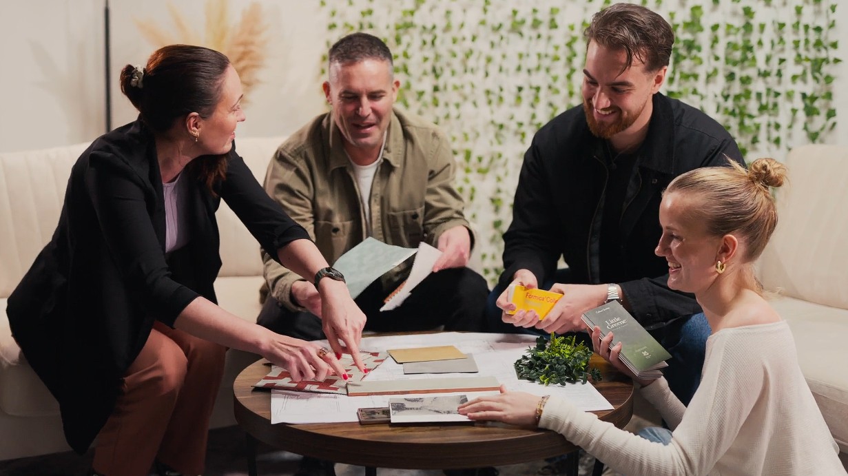
In this episode, Nick sits down with one of our own – Dean Waugh, owner and creative director of Retail Experience Design. With over a decade of experience transforming optical spaces, Dean shares his expertise on how opticians can maximise their space, boost profit margins, and enhance customer satisfaction by thinking like retailers.
SILMO takes place in September at Parc des Expositions, Villepinte, Paris. To learn more about the next event, visit www.silmoparis.com.
You can also listen to all episodes of The Right Optics podcast here.
The Right Optics: Are You Thinking Like a Retailer? With Dean Waugh
The Right Optics: Are You Thinking Like a Retailer? With Dean Waugh: Full Transcript
Introduction Nick (Speaker 1): “Hello and welcome to this latest episode of ‘The Right Optics by SILMO.’ As we continue our journey right into the heart of the optical industry, today we’re looking at how opticians can maximise their space, increase their profit margins, and achieve higher customer satisfaction by thinking like retailers.
Dean Waugh, who left a career working for big design agencies to set up Retail Experience Design 10 years ago, specialises in fitting out optical stores. He focuses on demographics, competitors, ranges, and merchandising to create unique buying experiences for customers. I caught up with him from his design studio a few weeks ago, just after SILMO Paris, and we started at the beginning. What exactly does he do at the heart of everything?”
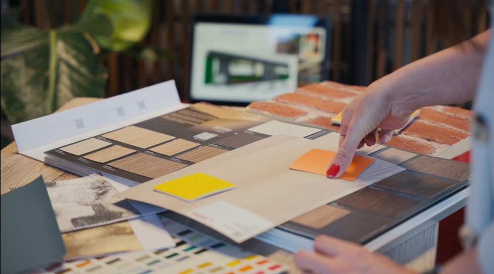
Dean (Speaker 2): “We’re a retail design agency, so we help multiple small businesses and evolving brands actually realise their physical identity. This involves us sometimes starting from scratch and helping a client from the very beginnings of their brand to work right through to a finished physical environment. This includes getting involved with different aspects of a project, such as space planning, brand design, and evolving concepts to a level where they can be developed across a bigger portfolio.”
Nick: “Doesn’t that make you a bit of a glorified shopfitter with a few bells and whistles?”
Dean: “It’s a fair question, and a direct answer is no, definitely not. We strive to be a creative design agency. From the very beginning of when we started, we often faced that question: ‘Why you? Why not a shopfitter? What’s the added value?’ A shopfitter is skilled at realising a concept and fitting a project into a physical space. From our end as a retail design agency, we are all about the design, understanding the customer, understanding the essence of what we’re trying to do in a project. Shopfitters are very skilled and adept at fitting a project, but they’re not designers, which is why we make a clear differentiation between ourselves and shopfitters.”
Nick: ” It strikes me, having spoken to a lot of opticians and retailers, that you’ve arrived at a good time. Over the last decade, there’s definitely been a shift in how opticians view their space. Not everyone – many still remain quite classic and traditional, and that works – but there is a growing number of entrepreneurs and business-minded opticians who have decided that the optician’s space should be and could be cool, funky, clever, and insightfully put together. Can you go back 10 years and look at the changes you’ve seen and why they matter?”
Dean: “Yeah, absolutely. When I started out 10 years ago, after leaving a bigger global design agency, I noticed a real lack in brand awareness and any understanding of what forms a retail environment, particularly within the optical market. Whether I was visiting an optician in Scotland or down south, the spaces were all very samey and generic. They were all fitted by a sort of standard shopfit setup with two or three key shopfitters operating within the sector.
They worked on this sort of master plan, almost like going to see a kitchen designer. You’d pick your base units, wall units, how many rods you wanted, and that was it. Your choice ended there. You could pick the colour of your base units or your worktop colour, so very similar to a kitchen principle. This meant that the entire optical sector looked very samey, with no real understanding of what created a design and what a retail environment should be.
It was fantastic for us coming into the industry because it was so apparent it was lacking in all the values that a lot of the other mainstream retailers had picked up on. With our experience working with global brands, it was a nice transition for us to get into this market placement and start to really talk to our clients about simple things like a zonal approach to the optical space – clearly defining where customers should sit and wait, where the counter would be, the size of the counter, where the brand should live, and a lot of the dispensing setup.
Back then, it was almost like an afterthought. Whoever worked on these spaces just worked through it. They’d put in a nice display of frames on a section of wall two meters long, and then they’d drop in two dispensing desks right in front of that wall, which was just counterintuitive for sales. You’d have a client and a doctor talking about the value of frames, and anyone wanting to look over their shoulder at the frames on display would find it a double negative.
We worked really hard to rationalise how the space should be divided. We’re now producing some really fantastic opportunities for dispensing. Coming from a strong retail background, the dispensing element of an optical business is really important because that’s where you’re selling the space and your brand to a client.”
Nick: “That brings to mind Stansted Airport. I remember when it was designed, and all of the talk was about how passengers arrive through the front door and then go in a straight line to the plane, without detour or deviation. The whole process is straightforward: you check in, go through passport control, the retail area, and then to the gate. What you’re describing feels like a very clear and relatively easy process for the client who comes into the shop and comes out the other side with prescription and frame.”
Dean: “Exactly, it’s a great analogy for customer flow, which was a massive part of the retail process that was being overlooked. Often, the client would enter a business, and there would be a straight run to a counterpoint. The counter would be massive, and there’d be a couple of receptionists maybe sitting at an incorrect level, so the eye contact wasn’t in the right form, or there was no branding for the business.
When a client walked in, they would then be directed towards the seats, which were generally thrown into the window. So when you have customers or potential customers walking past on a high street, all you see is the back of people’s heads. We work so hard to explain the logic of how the business would be perceived from different angles. What would that business look like from a passive footfall point of view?
And then, the engagement of a customer journey: as soon as a customer walks across that threshold, where do we want them to go? We want them past the product. We want the product to pop out. We’ve worked really hard to put in details like mid-floor units. We’ve made our perimeters really shoppable. Back 10 years ago, 15 years ago, there was a real push on display rods, and there are some very good display rods around now, but back when we first started working in the industry, they were very metal, very clunky, very over-engineered.
For me, coming from a retail background, there’s nothing worse than walking into a space and seeing 50 million rods displayed on metal bars that all intermingle and intertwine. We’ve worked really hard with our clients to educate them on thinking about, like, if you’re going to buy a pair of trainers or a pair of jeans, or another sort of piece of apparel, when you go shopping, it’s all about presentation. It’s all about the customer flow and the journey. We’ve worked really hard to give positive breaks to product, allow for clear and creative visual merchandising, and actually reduce the amount of stock on the wall because it doesn’t always help.”
Nick: “I’m so pleased you said that because I was literally about to talk about overwhelm. I have often discovered, particularly in some of the high street chains, that there is a sheer weight of product when you get in, which can be very overwhelming. I’ve seen it also in sunglasses shops, where you go in, and there’s just wall after wall of product.
This year at SILMO, I spent some time with Daniel Scott, one of the finalists in the International Optician of the Year Award. He’s an eyewear stylist. When I met him, he had this little case with him, and in it were about 16 frames, maybe no more. He happened to be wearing a frame that I absolutely loved. I said, ‘Daniel, I love your glasses. Where are they from?’ And they were from a brand called Alem.
He then opened his bag, and he just had a really reduced selection. I know it’s going from one extreme to the other, but I found glasses I loved in that tiny selection. It got me thinking about how shops have to cater for all sorts of types and tastes and colours of frames and sizes, but actually, if you overwhelm the customer, it may be counterproductive.”
Dean: “Absolutely, it’s a fine balance. Like you’ve correctly said, the amount of stock hinges on location, demographic, price points, and the brands that the client is selling within their space. But for us, we always advise where we can to be more sympathetic and more focused on delivering a nicer display of frames rather than sheer quantity.”
Nick: “How does that look in real terms, how does that work?”
Dean: “It’s fairly simple. We really try to steer away from metal rods. But the disclaimer is, obviously, there are some nice rods out there. All I can do is keep thinking back to when I used to trawl around different opticians and see metal rods and countless frames. But I think where possible, if you’ve got a frame bar and it’s got 15-20 frames, just drop the quantity.
So, in terms of how you can display a frame differently, there aren’t that many different techniques, really. You can place it on a flat surface – whether that’s a glass shelf, a timber shelf, or a textured surface – but there are so many ways to enhance the look of that frame and increase the perceived value.
We’ve done things like adding brand talkers, brand blocks, risers, different backgrounds, textures, finishes, and lighting techniques. And what that does is allow the brands to pop.
A lot of the brands that we’ve worked with, in the end, have had much more engagement and the opportunity to work with bigger and better frame brands simply because of the tools we’ve provided them for displaying their products.
We’ve found that not only does this enhance customer perception of the frames, but it also helps upsell higher-value frames. And, crucially, it opens doors to working with bigger and better brands, because those brands want to be in spaces that feel premium and well thought-out.”
Creative Frame Display & Risk-Taking in Retail Spaces
Nick: “Talking about how frames are displayed, I saw something really interesting at SILMO this year. There was one brand in Paris that had its frames displayed on really beautiful crockery – literally one frame per plate. The frames were positioned at a slight tilt, and it was all linked to their branding, which had some kind of culinary theme.
It looked amazing, and it stopped me in my tracks as I was walking down the exhibition aisles. So maybe part of this is not being afraid to take a risk?”
Dean: “Yeah, exactly, Nick. That’s a great point. When I visit different trade shows – whether they’re general retail shows or optical shows – I always see some really beautiful techniques for displaying frames.
At these shows, the exhibitors’ primary goal is to make their frames stand out and become desirable. But the same creative techniques that exhibitors use can and should be applied in retail stores.
We’ve worked with books, bookcases, concrete blocks, and different materials to create more interesting displays. These simple elements add a whole new dimension to how frames are presented.
For me, there’s nothing worse than walking into a space and seeing a wooden shelf against a magnolia wall, with a pair of £500 frames sitting in a dark corner of a shop. No wonder the customers aren’t picking them up or engaging with them!
So it’s about making the product pop and using props and visual theatre where possible.”
The Value of Design: How It Impacts Sales & Staff Experience
Nick: “Obviously, a key part of this is value. Anyone listening to this who’s considering a redesign, whether with you or someone else, is going to ask the same question: What’s the return on investment?
I’d be interested to hear how you view that ROI, and how you actually calculate it.
But first, one thing that’s come to mind—and it’s quite an intangible thing that I don’t think would necessarily help you sell your services—but I do believe that the better the environment an optician works in, the better they’re going to sell.
If you have staff working in a beautifully designed, well-thought-out shop, with comfortable seating, well-placed consultation areas, and a good flow, that’s going to create happier staff and happier customers, which in turn should result in better sales.
Does that hold true? And what else do you factor in when measuring success?”
Dean: “Yeah, absolutely. It’s a great point. For us, at the heart of what we do as a retail design agency, the focus is always on what it does—not just how it looks.
When we take on a project, it’s not about just making it pretty or flashy.
Sure, we could do the most outlandish store design ever—we could hang frames from fishing wire, put lasers everywhere, and probably even win a few design awards for it. But if it doesn’t function well, then it’s not worth it. Instead, we focus on ensuring return on investment. We ask:
- What’s the demographic of the store’s location?
- Who are the ideal customers?
- How can we attract those customers?
- What’s going to improve their experience in-store?
Those are the questions that drive the design. And the results speak for themselves.”
How Much Does a Store Redesign Cost?
Nick: “I appreciate that you might not be able to give me an exact answer down to the last penny, not least because it’s commercially sensitive, but also because every project is different.
For someone listening, though, are we talking about thousands, tens of thousands, or hundreds of thousands of pounds for a store redesign?”
Dean: “Yeah, that’s a tough question because, in truth, the cost can range from £10,000 to £300,000. It depends on:
- The size of the space
- The level of involvement needed
- The complexity of the design
What I can say is that we’ve built our entire business around independent retailers. So we always aim to make it commercially viable for an independent optician to come to us, redesign their space, make it more workable and profitable, and still see a return on investment within a few years.
We simply wouldn’t be in business if our pricing wasn’t realistic. It’s as simple as that.”
Real-World Success: Sales Increases After a Refit
Dean (continued): “If it helps, Nick, I’ve got some real numbers from recent projects.
For example, one of our clients, Lynn Fernandez, has had three refits with us. Her last refit was for retail only, and they reported a 20% increase in retail sales over the first nine months after reopening.
Another recent project, Edwards & Walker, had a 20% increase in sales month-on-month, along with 300 new patients and exams post-fitout.
Ashdown & Collins saw a 25% increase in weekly sales within just three months after their redesign.
And then there’s I-People, who had a 35% rise in turnover, a 17% increase in retail sales, a 15% increase in total profit, a 16.5% increase in clinical exams, and a 25.8% increase in new patients after their refit.
These aren’t random success stories—every project we work on has measurable success metrics.
We don’t just make spaces look nice; we make them work hard for our clients, improving both sales and customer experience.”
Final Advice: What Can Opticians Do Tomorrow?
Nick: “To finish, I know there will be people listening from different countries who might not have the budget to do a full store refit.
If you could give four or five simple tips that any optician could implement tomorrow to make a difference, what would they be?”
Dean:
- Declutter the reception area. Too many rods, leaflets, and lens solutions can overwhelm customers.
- Improve waiting areas. Don’t just dump chairs in a dark hallway—use lighting, AV screens, and brand messaging.
- Reduce stock overload. Too many frames on display can actually decrease perceived value.
- Make your brand stand out. Use signage, colour, and strategic placements to reinforce your identity.
- Create a clear, inviting customer journey. Guide customers naturally through your store with a well-thought-out layout.”
Conclusion
Dean Waugh’s insights make it clear: good design is about function, not just aesthetics. Whether it’s a full-scale store refit or just small, immediate changes, thinking like a retailer – not just an optician can transform sales, customer experience, and brand perception.
Related articles